On the Same Wavelength
Wavelength Studio is a Bristol-based video production and photography studio, dedicated to transforming complex technical concepts into compelling visual stories for science and deep tech companies.
Challenge
With a strong vision in place, the startup needed a brand identity that authentically reflected its expertise. Our goal was to develop a professional and engaging identity that would resonate with scientific and tech audiences while capturing the studio’s creativity and commitment to high production values.
Approach
Instead of focusing on competitors in video and photography, we took a broader approach, looking at the science landscape for inspiration. Collaborating closely with the client through mood boards and research, we co-created a brand that founder Christy could fully embrace and make his own.
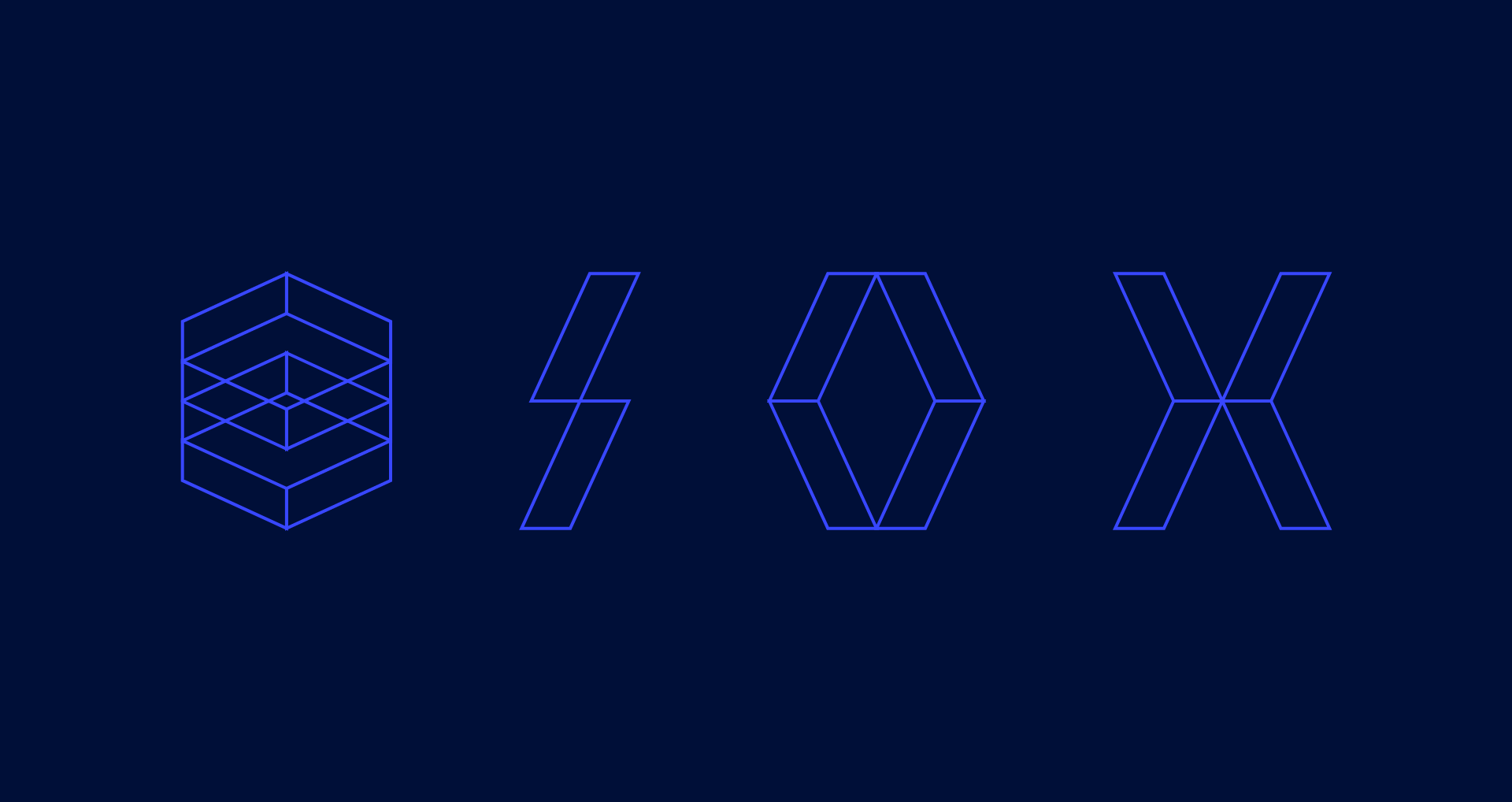
Solution
The identity takes inspiration from the mathematical symbol for wavelength, the Greek letter lambda. Drawing from Christy’s physics background, we incorporated a gradient transitioning from blue to red, reflecting the opposite ends of the visible light spectrum.
For typography, we chose Matter, a grotesk sans serif with a subtle warmth, paired with Matter Mono, a typeface reminiscent of programming code. Designed by Displaay Type, both typefaces reinforce the brand’s deep connection to science and technology.